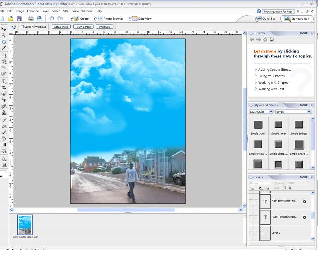
The colour use in this poster is great because it really goes with the theme if it was really dark and dull colours i wouldnt have recommended it. The layout of the poster itself is very good indeed I see creativity on the thinking bubble from John's head. It follows the simple layout of a real poster and that makes it good. Try make the text font more appealing and attracting to relate it more to the main theme
This is a really good poster, probably the most professional I've seen.. I like the blend you've done from the actual image to the clouds, the effect you've put on it stands out, its got a very 'real' touch. You can see from the thought bubble that he's dreaming of rekindling the relationship with his mum which is what the whole film is about, so you've shown that very successfully. Well done :)
The best of the three poster and the most professional follows the theme of the film nicely howver you need to keep the font the same throughout all 3 poster which you have failed to do, you font her is blue impact however in the other 2 the title font is different this fails to show the campaign of the film, i feel you should change the font on the other posters to this one ! :)
I must agree this poster is the best of all 3, if i did not know any better i would think it was done by a professinal poster company, the use of colour and positioning is very eye catching and pushes me into reading more of it. It highlights how much effort you have encoorporated. Good work


The colour use in this poster is great because it really goes with the theme if it was really dark and dull colours i wouldnt have recommended it. The layout of the poster itself is very good indeed I see creativity on the thinking bubble from John's head.
ReplyDeleteIt follows the simple layout of a real poster and that makes it good.
Try make the text font more appealing and attracting to relate it more to the main theme
This is a really good poster, probably the most professional I've seen.. I like the blend you've done from the actual image to the clouds, the effect you've put on it stands out, its got a very 'real' touch. You can see from the thought bubble that he's dreaming of rekindling the relationship with his mum which is what the whole film is about, so you've shown that very successfully. Well done :)
ReplyDeleteThe best of the three poster and the most professional follows the theme of the film nicely howver you need to keep the font the same throughout all 3 poster which you have failed to do, you font her is blue impact however in the other 2 the title font is different this fails to show the campaign of the film, i feel you should change the font on the other posters to this one ! :)
ReplyDeleteI must agree this poster is the best of all 3, if i did not know any better i would think it was done by a professinal poster company, the use of colour and positioning is very eye catching and pushes me into reading more of it. It highlights how much effort you have encoorporated. Good work
ReplyDelete